Pages

Friday, July 31, 2009

Stampin'B's Challenge #17 - Baby Card

Nicole was our hostess on the Stampin'B's DT Blog this week. Her challenge was to make a baby card in colors other than pink or blue. In addition, it had to be a square card.

I like doing baby cards in colors other than pink or blue because you can do them ahead of time, without worrying about what the baby will be. Nicole’s challenge gave us that opportunity. I used a piece of DP from a pack called Victoria Mini Papers from Jenni Bowlin and went with the yellow and green in the paper. As part of Nicole’s challenge was to make a square card, I didn’t even have to trim the DP -- it was already 4 inches by 4 inches. I stamped a heart-shaped sentiment from a set of Fiskars baby stamps and cut it out using my Nestabilities heart dies. I used Barely Banana and then sponged it with So Saffron to make the edges a little deeper shade of yellow than the center behind the sentiment. I had some safety pin-shaped brads, which I attached to the Double-ended tags, also from Spellbinders, for the lower sentiment. The green plaid DP is from a DCWV pad called Nana’s Nursery. The matting and scalloped pieces are cut from Certainly Celery, and the card base is white.

Stamps - Fiskars
Paper - GP White, Certainly Celery, Barely Banana, DCWV Nana's Nursery DP, Jenni Bowlin Victoria Mini Papers DP
Ink - Versafine Black Onyx, So Saffron
Accessories - Nestabilities Heart and Scallop Oval dies, Spellbinders Double-ended tags, Safety pin brads, Sponge Dauber

To see the rest of the team's creations, check out the Stampin'B's Blog.

Tuesday, July 28, 2009

Big Shot and Halloween

I was visiting my sister this weekend, and we decided to play a little bit with my new Big Shot accessories. She also has a Big Shot, so I didn’t have to cart that along with me on my drive to Southwest Florida.

The cards were cut out with the Sizzix Movers and Shapers die, one with a three-hole insert and the other with a one-hole insert. I “borrowed” the idea for the witch card from my friend, Rosemary. After sponging a big circle lightly with More Mustard ink on the upper right-hand corner of a 4-inch by 4-inch piece of white cs, I punched a circle template with a 1 ¾ inch circle punch. I then sponged inside the circle more firmly – forming the moon. I sponged the rest of the square with Not Quite Navy. The fancy witch is from an Inkadinkadoo Halloween set I bought last year. She is stamped with Versafine Black Onyx, as is the sentiment. The three spiders, from PTI’s Spooky Sweets set were stamped through the small holes onto the inside white piece.

The scarecrow on the other card is from a brand-new Debbie Mumm autumn set, as is the pumpkin on the inside. Both are stamped with Palette Noir Black and then colored with Prismacolor and Copic markers. The DP behind the scarecrow is from a Debbie Mumm DP pad called Harvest and Holiday.

The two candy containers were made from the Sizzix Matchbook XL die from Stampin’ Up. After punching out the centers with SU's curly label punch, I glued some acetate over the openings and put the circle sentiments, both from PTI’s Spooky Sweets set, to one side of the hole so you can see the candy inside.

* Stamps – All Hallows Eve by Inkadinkadoo, Harvest by Debbie Mumm, Spooky Sweets by PaperTreyInk
* Paper – Bazzill Textured Orange, Basic Black, GP White, Debbie Mumm Harvest and Holiday DP
* Ink – Versafine Black Onyx, More Mustard, Not Quite Navy, Palette Noir Black
* Accessories – Big Shot, Sizzix Matchbox XL Die, Sizzix Movers & Shapers XL Die, Sizzix 3-Hole inset, Sizzix One-Hole inset, Prismacolor and Copic markers, Sponge daubers, 1 ¾ inch circle punch, Curly Label punch

Friday, July 24, 2009

Stampin'B's Challenge - No Stampin'

Vicky Gould was the hostess of the Stampin'B's DT Challenge this week. Her challenge was to make a tall card, with no stamping. We could use any kind of die cut or whatever that we liked.

I found this challenge quite interesting. I recently received a set of Spellbinders Daisy Head dies from a friend and decided they would work well on a tall card. After cutting them out, I used a sponge dauber and Pumpkin Pie ink to highlight the embossed portions of the flowers. Because the card is tall, I was able to use my Long Rectangular nesties to cut the panel behind the flowers and Sizzix leaves, which were cut from Always Artichoke cs. I sponged the background of the vanilla panel using a sea sponge and Always Artichoke ink. I like the way the sea sponge looks -- with a varigated pattern. The sentiment on the oval panel was cut with a Cuttlebug Olivia alphabet die from the same DCWV DP as the border down the side, which is punched with a Martha Stewart lacey border punch.

* Paper - Mellow Moss, Always Artichoke, Pumpkin Pie, Very Vanilla, DCWV Pocket Full of Posies DP
* Ink - Pumpkin Pie, Always Artichoke
* Accessories - Spellbinders Daisy Heads dies, Nestabilities Long Rectangle and Oval dies, Cuttlebug Olivia alphabet die, Sizzix leaf die, Sponge dauber, Sea sponge, MS lacey border punch

You can see all the cards for this Stampin'B's challenge here.

Sunday, July 19, 2009

Two Challenges -- More Butterflies

I did a couple of SCS challenges in the past few days -- the Inspiration Challenge and the Featured Stamper Challenge. I wound up using a butterfly for both.

Saturday's inspiration website was so full of wonderful stuff. I chose this -- http://www.tracyporter.com/Katsina-R...r-p-17534.html -- because I thought the design on it looked like a butterfly and I loved the colors. I stamped two images of my favorite butterfly stamp, SU's retired Stipple Butterfly, and colored it with Prismacolor and Copic markers. I cut one image out with a Nestabilities die. After going over the second butterfly with a Stardust gel pen to give it a little shimmer, I cut it out totally and popped it up on the first one. It's hard to see on the photo, but I stippled the white circle with River Rock.

* Stamps - Stipple Butterfly and On Your Birthday
* Paper - Really Rust, Always Artichoke, GP White, SU patterned paper
* Ink - Palette Noir Black
* Accessories - Prismacolor and Copic Markers, Sakura Stardust gel pen, Nestabilities


Today's Featured Stamper was another unknown to me. As I was wandering through Diane's gallery I found this card -- http://www.splitcoaststampers.com/ga...p;ppuser=70774 -- that caught my eye. I loved all the butterflies on her card, so I kept them all, as well as the layout. What I changed was: different stamp for the large butterfly; smaller stamps instead of DP for the border; different shape for the sentiment; and eliminated the flourish.

* Stamps - Butterfly of Happiness, It's Your Birthday
* Paper - Basic Black, Summer Sun, Very Vanilla
* Ink - Versamagic Black Onyx, Mellow Moss
* Accessories - Nestabilities, Copic and Prismacolor markers, Stipple brush, Sponge dauber
Both of these cards also qualify for the Stampin'B's challenge this week which was to use a butterfly. If you'd like to play along, here's the link -- http://stampinbsdesignteam.blogspot.com/

Friday, July 17, 2009

Stampin'B's Challenge and More

I love butterflies, so for my stint as hostess of the Stampin'B's Design Team Blog challenge this week, that's just what I challenged the team to do -- put a butterfly on your card. I was looking for a different layout when I came across a website called Page Maps and found a sketch on the June page http://pagemaps.com/jun09cardmaps.htm that looked interesting.

I cut the smaller circles from both designer paper and Pretty in Pink cs with my Nestabilities dies, but the largest one was bigger than the largest die in the set; so I used a Fiskars circle template and a craft knife. I stamped the butterfly from the Rita Marie's Make a Wish set twice, coloring both with Prismacolor and Copic markers. I patted one of them with a Versamark pad and sprinkled it with halographic embossing powder so that it glitters. After gluing all the circles down on a piece of So Saffron cs, I stamped the greeting from the Rita Marie's Words to Live By set. One thing I like about clear stamp sentiments is that you can bend them to different shapes -- in this case, circular. I cut out the second butterfly and mounted it with a couple of glue dots and bent up the wings. I added a few punched out butterflies for accent.

* Stamps - Make a Wish and Words to Live By, both by Rita Marie and Company
* Paper - Pretty in Pink, So Saffron, GP White, DP from Rita Marie and Company
* Ink - Palette Noir Black, Versamark
* Accessories - Prismacolor and Copic markers, Halographic ep, Fiskars circle cutting template, MS punch


I didn't get to play Wednesday's Sketch Challenge, so I combined it with Thursday's Ways to Use It challenge (Seeing Double). I made two stemmed daisies using Rita Marie and Company's Words to Live By. The daisies are colored using Prismacolor and Copic markers, with a "glow" created by sponging some So Saffron around them. I added a few primas for some depth.

* Stamps - Words to Live By from Rita Marie and Company
* Paper - GP White, Perfect Plum, various DP from Rita Marie and Company
* Ink - Palette Noir Black, So Saffron
* Accessories - Prismacolor and Copic markers, Primas, Brads, Sponge dauber
All stamps and DP on both cards can be found at http://www.creativescrapboutique.com/

Sunday, July 12, 2009

Featured Stamper - Twilight Inspired

My card for SCS's Featured Stamper challenge this week is a birthday card for my daughter, a BIG Twilight fan, much like her mother!

I admit I had just started making a card when the Featured Stamper for this week was posted. Congrats to Kelly (a/k/a schirmcat)! So I looked through Kelly's gallery to see if I could find a card that had the feel of what I was going for. Voila, I found one -- her Dream Big Batik. I kept the two palm trees and the oval sentiment. What I changed was:

* A seashore scene rather than what looks like a desert
* The color scheme
* I added a second oval sentiment panel

Those of you who have read Twilight will understand the scene.

* Stamps - Beach Life by Flourishes, Fictionally Inspired by Artful Inkables
* Paper - Tempting Turquoise, Night of Navy, Bordering Blue, GP White
* Ink - Palette Noir Black, Night of Navy

* Accessories - Cuttlebug, D'Vine Swirl embossing folder, Prismacolor and Copic markers, Nestabilities

I also made the gift I'm giving my daughter - a charm bracelet, using charm I found on the Artful Inkables site when I was looking at the Twilight-inspired stamps. I have a friend who is much more talented in the jewelry-making department, but I think Kathi will enjoy this bracelet. It has eight charms, all Twilight-related.

Friday, July 10, 2009

Two More Challenges

Another day with two challenge cards -- one from today, one from last Tuesday. My first card is my entry in this week's Stampin'B's Design Team Blog challenge. NancyRuth was our hostess, and her challenge was to use only neutrals -- white, grays, black, browns.


Unlike Joanne (jojot), I don’t often stamp in black and white, but this sounded like fun. I stamped the largest flower from Rita Marie and Company’s Violet Garden set twice and colored them with Prismacolor and Copic markers in various shades of gray. One image I cut out and popped up at an angle over the first one. Using a corner punch, I rounded two diagonal corners of the image panel. After getting permission from Salpi Kazezian, the designer of the Rita Marie Violet Garden DP, to copy it on my copy machine in black and white, I used it as the background for my card. The sentiment is from Words to Live By, also by Rita Marie and Company, embossed in black. I added a couple of black eyelets and some black & white ribbon for accent.Both stamp sets and the designer paper can be found here -- http://www.creativescrapboutique.com/

* Stamps - Violet Garden and Words to Live By by Rita Marie and Company
* Paper - Going Gray, Basic Black, GP White, b&w copy of Violet Garden DP by Rita Marie and Company

* Ink - Palette Noir Black, ColorBox Dragonfly Black pigment
* Accessories - Clear ep, Ribbon, Eyelets


This week's Timeless Tuesday on the Flourishes Forum at Splitcoaststampers was to make a card in which you cut out part of the image and pop it up. The top leaf is popped up once, and the lemons are popped up twice. I'm not sure you can see it in the photo, but I embossed the lemons with clear embossing powder. The layout is exactly what I had in mind when I started, but I think I like the final version. After I laid out the two yellow circles, I cut out the overlay portion so that it wouldn't be so bulky.

* Stamps - Life, Love and Lemons by Flourishes
* Paper - GP White, Wild Wasabi, So Saffron, Basic Grey Lilykate DP
* Ink - Palette Noir Black, So Saffron
* Accessories - Versamark pen and Clear ep, Nestabilities, Copic and Prismacolor markers, Ribbon, Corsage pin, Beads, Gel pen

Thursday, July 9, 2009

July's Twilight Tuesday Sketch

I'm new to the Twilight Tuesday challenges but decided to dive right in.

This was a very interesting sketch. My inspiration was, obviously, Bella's truck, but I brought in her friendship for Jacob -- thus the nickname "Wolf Girl." I thought the truck would fit in the three-panel section; however I discovered that it was too big for a standard A2 card. I had some stray envelopes and found a slightly larger one into which a big-enough card would fit. (As an aside, I try to make cards that will fit in envelopes that I have gathered so that I will be able to mail them neatly.)

I colored the truck with Prismacolor pencils and Gamsol and then cut the panel into three sections, matting them in Real Red. In keeping with the Twilight colors, I used some Basic Gray DSP for the background. I stamped the sentiment in a punched square for the piece at the top right.

* Stamps - Into the Moonlight and Fictionally Inspired by Artful Inkables
* Ink - Palette Noir Black
* Paper - Basic Black, Real Red, GP White, Basic Gray DSP
* Accessories - Prismacolor pencils, Gamsol, Square punches

Wednesday, July 8, 2009

Two Challenges

I was able to do two SCS challenges in a row this week -- the Color Challenge and the Sketch Challenge.


I decided to pull out my long-neglected chalks for the Sketch Challenge, and what a delightful sketch it is. Using various DPs from Rita Marie and Company for the backgrounds, I enlarged the main panel to accommodate the size of the violet image.

* Stamp - Violet Garden by Rita Marie and Company
* Ink - Palette Noir Black
* Paper - Perfect Plum, GP White, various DPs from Rita Marie and Company
* Accessories - Pebbles chalks, Scallop corner punch, MS pearls

My friend Faith was the guest hostess for the Color Challenge, one that I rarely do for some reason. I used a brand-new stamp from Whiff of Joy and colored her with Prismacolor and Copic markers in the color challenge colors -- Bashful Blue, Tempting Turquoise, Apricot Appeal, and Creamy Caramel. I sponged around the main panel with Apricot Appeal and used some Tempting Turquoise DSP and Apricot ribbon.

* Stamp - Willow and Flower Basket by Whiff of Joy
* Ink - Palette Noir Black, Apricot Appeal
* Paper - Creamy Caramel, Tempting Turquoise, GP White, Tempting Turquoise DSP
* Accessories - Prismacolor and Copic markers, Ribbon, Sponge dauber

Stamps and Rita Marie DP can be found at Creative Design Boutique.

Monday, July 6, 2009

Stand Up Cards

Today's Technique Lovers Challenge was a Stand-Up card. It was a new fold to me, and I really enjoyed making these cards.

I used Flourishes new set Life, Love and Lemons on my first card. I added a couple of lemon slices down in the corner with some lemon drops. Actually the lemon slices were an after-thought. I had smudged some green ink on the card and needed to hide it. As I've heard my SU upline say, "There is no such thing as a mistake in stamping, just an opportunity to get creative." I put Crystal Effects on the lemon drops to make them stand out a bit.

* Stamps - Live, Love and Lemons by Flourishes
* Paper - Certainly Celery, Wild Wasabi, GP White, DCWV Citrus DP
* Ink - Palette Noir Black
* Accessories - Prismacolor and Copic markers, Crystal Effects


I had so much fun with my first Stand Up card that I had to do another one. This sweet little fairy is part of Rita Marie and Company's set called Make a Wish. She is colored with Prismacolor and Copic markers and then cut with a Labels Four Nestabilities die. The DP, also from Rita Marie and Company, is from the Cynthia Signature Series. Both stamps and DP can be found at http://www.creativescrapboutique.com/

* Stamps - Make a Wish by Rita Marie and Company
* Paper - Bashful Blue, Not Quite Navy, GP White, Cynthia Signature Series DP from Rita Marie and Company
* Ink - Palette Noir Black, Pretty in Pink
* Accessories - Prismacolor and Copic markers, Labels Four Nestabilities, Sakura Stardust gel pen, Sponge dauber

Saturday, July 4, 2009

Inspiration Challenge

Today's SCS Inspiration Challenge was to create a card inspired by a poster from this site http://www.posters.com/

After looking through many of the categories, I settled on a Monet painting of waterlilies -- http://www.posters.com/pv-424702_Water-Lilies.html -- so that I could used my as-yet-uninked Waterlily set from Flourishes. After much masking and stamping, I colored the waterlilies and lily pads with Copic and Prismacolor markers. To give the water a lighter feel, I used some Pebbles Pearlescent chalks in two shades of turquoise. I thought the EK Success border punch gave the feel of water.

* Stamps - Waterlily by Flourishes
* Paper - Pre-made white cardbase, Basic Black, Gina K Designs Luxury White, Tempting * Turquoise DSP
* Ink - Palette Noir Black, ColorBox Dragonfly Black pigment
Accessories - Prismacolor and Copic markers, Pebbles Pearlescent chalks, Clear embossing powder, EK Success border punch


There was so much to look at on the website of today's Inspiration Challenge that I had to make a second card.

Big Johnny Depp fan that I am, I chose this poster -- http://www.posters.com/pv-552761_Pir...n--Johnny.html I had bought this Rubber Stamp Avenue pirate stamp (which is NOT supposed to be Capt. Jack Sparrow, but you'll never convince me of it) at a stamp show last year and have had a lot of fun with it. I colored it with Prismacolor and Copic markers and mounted it on several mats. The other two stamps are from a Changito Pirate set. Because Capt. Jack's ship is the Black Pearl, I colored the three MS pearls with Black Prismacolor marker.

* Stamps - Pirate by Rubber Stamp Avenue, Changito Pirates by Stampendous
* Paper - Purely Pomegranate, Basic Gray, Going Gray, GP White
* Ink - Palette Noir Black, Versamark
* Accessories - Prismacolor and Copic markers, Nestabilities, Martha Stewart pearls

Friday, July 3, 2009

Stampin'B's Challenge - Use Metal

Faith’s challenge to use metal on our card this week set me to thinking. Rather than use the first thing that came into my head, which would have been hardware of some kind, I decided to take her literally.

So I used a piece of gold-colored sheet metal I had left from a class I took about a year ago. I ran the metal through my Cuttlebug, using the Bird Call embossing folder. After making a frame using a piece of chipboard, I covered it with Always Artichoke DSP and taped the gold piece behind it. I pierced down the sides of a piece of Very Vanilla and glued it to a Kraft card base. Olivia the Owl was stamped with Palette Burnt Umber ink and colored with Prismacolor and Copic Markers and then glued onto the front of the frame. A few pieces of ribbon and the sentiment cut with my Word Window Punch and I was finished. The sentiment was a little longer than the opening in the punch, so I cut it out fully and then fed it into the under side of the punch to cut each end.

I included a photo of the inside where I used another piece of the Always Artichoke DPS and stamped the end of the sentiment.
Images may be seen at Sweet 'n Sassy Stamps.
* Stamps - Owl Occasions by Sweet 'n Sassy
* Ink - Palette Burnt Umber
* Paper - Kraft, Very Vanilla, Always Artichoke DSP
* Accessories - Gold sheet metal, Cuttlebug and Bird Call folder, Prismacolor and Copic markers, Paper piercing tool, Ribbon, Chipboard, Word Window punch

Thursday, July 2, 2009

Way To Use It Challenge

Melody was subbing in the Way To Use It Challenge on SCS today. She sure picked a "challenging" challenge for us -- to use corregated cardboard on our creation. She did give us a hint on how to remove one side of the cardboard. If you spray it with water and let it sit for a minute or two, it will peel right off. Guess what -- it worked!

After peeling off the one side of the corregated cardboard, I cut the Top Note shape, cutting off outside the dotted line. I mounted it on a piece of Regal Rose cs also cut with the Top Note die. The flower is from Rita Marie & Company's set Violet Garden, colored with Copic and Prismacolor markers. I cut out the violet and backed it with a Sizzix leaf diecut, accented with some Copics; then glued them both to the cardboard. I wanted to dress it up a little, so I added the brads at the top. I sponged around the white card base with Creamy Caramel.

* Stamp - Violet Garden by Rita Marie and Company
* Paper - GP White, Regal Rose, Wild Wasabi
* Ink - Palette Noir Black, Creamy Caramel
* Accessories - Corregated cardboard, Prismacolor and Copic markers, Sizzix leaf die, SU Top Note die, Brads, Sponge dauber

Stamps can be seen here -- http://www.creativescrapboutique.com/

Wednesday, July 1, 2009

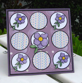
Circles and Violets

Today is the first day of my stint as a member of the Design Team for Creative Design Boutique. I used SCS's Sketch Challenge 235 for this card.


We were to use nine circles or nine squares on a square card. As you can see, I chose the circles. The images are from Violet Garden, and the DP is Micro Dots Jubilee and Circle of Love. All products are by Rita Marie and Company. I stamped the flowers twice, coloring with Prismacolor and Copic markers, and cutting one set out with a 1 3/8" circle punch. The other set I cut with scissors and popped up over the flat image. I added some yellow stickles to the centers for a little bling. I used a black mat to make the lighter colors pop. All products can be found here -- http://www.creativescrapboutique.com/

* Stamps - Violet Garden by Rita Marie and Co.
* Paper - SU Perfect Plum and Basic Black, GP White, Micro Dots Jubilee DP and Circle of Love DP from Rita Marie and Co.
* Ink - Palette Noir Black
* Accessories - Prismacolor and Copic markers, 1 1/2 inch and 1 3/8 inch circle punches, Stickles, Pop Dots